Spruce Up Your Space
Accessorizing your space is the most fun and easy way to create an individualistic ambience. The way we choose to arrange and accessorize also speaks volumes about our personalities, as well as how we feel, the things that interest us, and maybe even our pasts (i.e. travels, family, experiences). There are many ways to decorate using objects such as books, wall hangings, lamps and lighting fixtures, memorabilia from past travels, items found outside (such as pinecones), mirrors, vases, greenery, and articles found in a store one simply finds aesthetically pleasing. Another idea for accessorizing is to take everyday items out of context, which can become decor/works of art when put on display. The bottom line is just to have fun and experiment with what makes you feel at ease and dynamic in a comforting surrounding.
Details to consider when deciding on how to tailor your space are: the color, the size and shape of objects and furniture, the position of the these items in relation to what they are surrounded by, and the position of the objects in relation to what they rest on.
When beginning your project, it is necessary to take a look at the basic color of the space.
Generally, it is a good idea to choose a neutral color as the basis, but everyone has their own preferences and there are many amazing spaces that are based in non-neutral colors. This color will generally make up around 60% of the area one is working with.
Once you have recognized this, pick or understand what the secondary color is. This may be sizable pieces in the space or even a large (in proportion to the area) accent wall. It is always a good idea to spread this color over the space as not to have only one piece or area with this color or in the color family. This color should be around 20% of the space.
Lastly, choose the color(s) that will be your accent(s). This group will make up around the last 10%. It is important that your accent color not be much greater than this, as it is a focal point and can be a bit overwhelming when used too often over the space. As mentioned before, everyone has their own preference; it is just important that the space is appealing and comfortable.
1.  2.
2. 
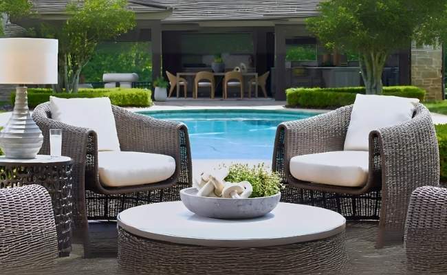
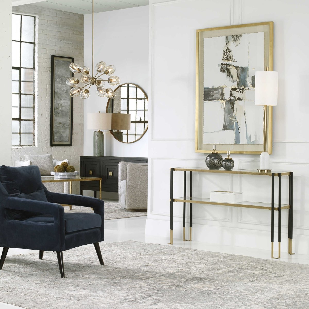
In photos 1 and 2, you will notice that white is the base color, grey is the secondary color, and blue, black, and gold are your accent colors.
When considering the size and the shape of certain objects remember that you never want to mirror objects completely, unless you are setting a long dining room table (or similar project). Items should be placed in an arrangement similar to the “rule of thirds,” as in photography. This rule states that if two lines are drawn vertically and two lines horizontally, at the one-third and two-thirds mark respectively, the eye will feel more at ease with the dominant object resting on one of the four points at which the lines cross; and the smaller, or more recessive, components at another crossing point. For example, placing a taller or larger object towards one end of a mantle, and a slightly smaller piece towards the other end, will help to break the tension created by having two identical pieces mirror one another on either end.
The same concept applies to setting a couple of ornamental vases/décor on a console or side table. There should also be a small variance in size, not two identically sized objects next to one another. There are, however, exceptions to this rule depending on the placement of other items and the balance of the space.
It is also uncomfortable for us when there is a dramatic difference in the size of the objects, as one will overpower the other or even seem like the larger may topple over! The same applies to setting an oversized article on a smaller piece of furniture or a tiny article on an oversized piece of furniture. We don't want one to absolutely overwhelm the other, as we have carefully chosen every element in the room and they all deserve attention.
3.  4.
4. 
As you may notice in both photos, the lamps are placed to one side of the console and side table with smaller decorative items towards, but not fully at, the other end of each piece of furniture. In both examples, notice the groupings of items. In photo 3, the two vases on the side table are positioned just to the left of the center of the table, as not to be directly next to the lamp and exaggerate the size of either object. In each grouping, none of the objects placed together are of the same height.
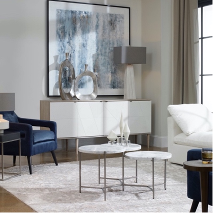
In picture 4, the decor on the table in the foreground is arranged in a triangular pattern to create a visually pleasing aesthetic accentuating the differing heights of the items. If there are a few pieces that are the same size, you’d like to assemble, try utilizing other objects you can find, such as books, to alter their height and fashion a more interesting structure for the eye.
Also, think about the shape of the medium the accent décor rests on. For example, items can be arranged on a long running table in a straight line, emphasizing extended lines, or in triangular/clustered groups to construct a weighted feel in a certain area or to provide a different impact on the observer.
Setting a few pieces on a decorative tray can be a fun way to feature them, making it easy to move the whole arrangement out of the way or to another area keeping it stable (if resting on a bed or plush surface).
When considering wall décor, it is important, once again, to really observe the surrounding space. Size, color, and shape are very important!
If you have a smaller space, a strategically placed mirror can create a sense of openness. Mirrors with different styles of cross-hatching can easily be mistaken for extra windows allowing the reflection of natural light.
The colors chosen for wall décor should tend toward, if not utilizing, the accent colors. Wall art should stand out, not blend in with the surrounding. It is also common to mimic shapes in the space with larger objects such as paintings and other framed articles.
Smaller wall décor, such as pendants, should have a much sharper contrast to their surroundings to avoid being engulfed.
5.  6.
6. 
In both of the above photos, you see how mirrors are used to open the space reflecting the abundance of natural light.
The long narrow canvas in the background of photo 5 is an example of using wall décor to reiterate other natural shapes in the space. Mimicking the tall, narrow shape of the window, yet not reaching the same height, it serves as a bridge to the lower and smaller pieces in the room. You may also note the colors in the painting and frame echo the accent colors of the space. The painting in the foreground of the photo is larger and loftier, bridging the high ceiling to the lower furnishings. You may prefer to choose an arrangement of smaller framed pictures/art that reach a bit higher, rather than one large piece.
The pendants in photo 6 are examples of smaller wall décor with a sharp contrast, preventing them from getting lost in the large, white, wall space. You will notice the sharp, contrasting, color reflects the accents in the side tables, the chest at the foot of the bed, and the chair at the left corner of the photo tying the room together.
Lighting, alone, is a whole subject that one can spend hours, days or weeks, even years, studying. There are many things to consider when picking out the type of lighting for the space. Here we will only discuss lighting for décor purposes. When considering lighting, it is important to decide what color lighting you would like (i.e. soft, fluorescent or mostly natural) as well as what the actual fixture looks like.
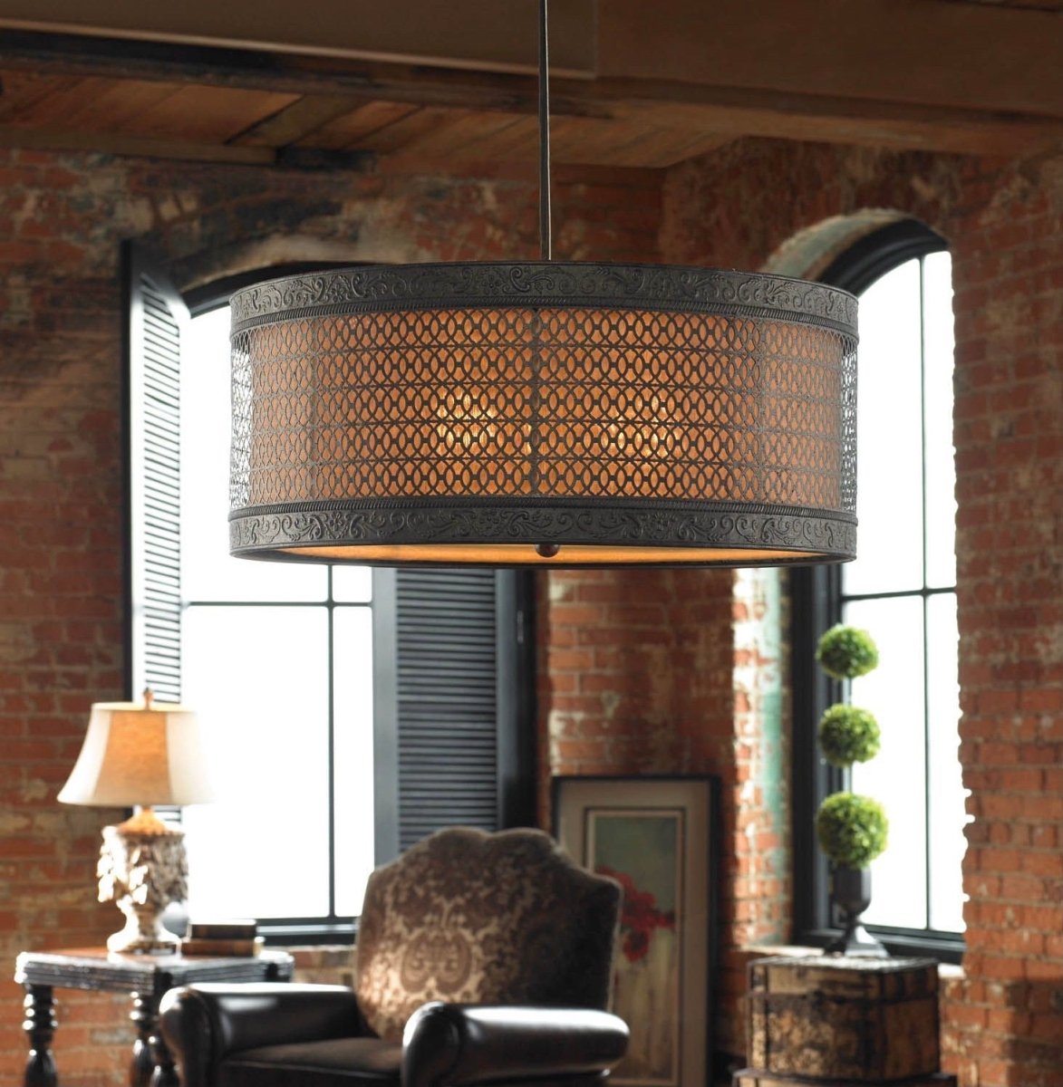
7.  8.
8.
In the pictures you will notice the two lamps are very modest and most likely do not give off a great deal of light. This was chosen due to the abundance of natural light in the space, streaming from the lofty windows.
The lamps, themselves, do not draw immense engagement, simply transport slight hints of the accent colors a bit further into the room, as seen in photo 7. This creates a more modest décor throughout the space, lending itself to an opening for a focal point: the hanging light fixture. If the decor in the space is over-embellished, the ornate light fixture would be lost in the chaos.
In a space filled with many decorative objects or colors, the light fixture can be more conservative as not to detract from the décor and vice versa. You may notice that the hanging light also repeats one of the accent colors of the room bringing it into full circle, as seen in photo 8.
There are many different schools of thought when it comes to decorating one’s space. Here we focus a bit more on modern styles of decorating. In the end, we cannot emphasize enough that decor decisions depend on each individual and what makes us most comfortable in our own space or one we are decorating/designing.
Sometimes it takes spending time in the space to understand what really works. You may totally bomb it on the first few tries, but hopefully it will at least create some sparks!

Leave a comment
This site is protected by hCaptcha and the hCaptcha Privacy Policy and Terms of Service apply.