Light oak is easy to love. It brightens a living room without feeling stark, and its grain brings in just enough texture to keep a neutral space interesting. The tricky part is everything around it: the wrong rug can make the table disappear, while too many accessories hide the wood you chose it for in the first place.
Why Light Oak Feels So at Home in a Modern Room
Light oak lands in a comfortable middle ground. It has more warmth and character than painted white furniture, but it does not carry the visual weight of walnut, espresso, or black wood. That is why it slips so naturally into modern, Scandinavian, transitional, and organic interiors without forcing the rest of the room into one strict style.
What matters most is the undertone. "Light oak" can mean honey, sand, pale taupe, or an almost chalky whitewash. Once you notice which direction your table leans, the surrounding choices get much easier. You are looking for colors that belong in the same conversation—not an exact wood match.
A warm oak table usually feels at home beside cream upholstery, camel leather, ivory boucle, antique brass, warm white walls, olive accents, and natural woven fibers. A cooler pale-oak or whitewashed table can support soft gray, stone, charcoal, matte black, brushed nickel, and blue-gray textiles. In either case, the goal is repetition without duplication: echo the warmth or coolness once or twice, then introduce contrast.
Look at the Room Before You Style the Table
Before reaching for books, bowls, or trays, step back and look at the table beside the sofa and rug. Pale oak can vanish on a flat beige rug in front of a cream sofa. At the other extreme, it can look stranded when every surrounding piece is dark and glossy. More tabletop decor will not solve either problem. A better rug, a repeated wood note, or one dark accent usually will.
If you are still deciding on proportions, use the separate coffee table sizing guide to confirm length, height, and walkway clearance. Once the scale is right, use the decisions below to make the wood finish feel intentional.
| If your room has... | Choose this rug direction | Add this contrast | Avoid |
|---|---|---|---|
| Cream or ivory seating | Oatmeal, greige, or a subtle pattern with medium-value lines | Matte black, dark bronze, or charcoal | A flat rug that matches both the sofa and table |
| Gray upholstery | Warm gray, taupe, or ivory with tan movement | Antique brass, warm ceramic, or camel leather | Too many cool blue-gray finishes |
| Walnut or dark wood nearby | A quiet neutral that contains both light and dark notes | Repeat each wood tone once elsewhere | Trying to force an exact wood match |
| White walls and minimal decor | Textured wool, jute blend, or a low-contrast geometric | A sculptural dark object or substantial greenery | Only small pale accessories |
Three Easy Ways to Dress the Table
It helps to think in small groupings rather than individual objects. A bowl counts as one group. So does a short stack of books or a vase with a loose branch. On a generous rectangular table, three groupings usually feel finished without covering every inch of the surface.
Keep It Quiet
Try: one wide ceramic bowl, tray, two stacked books, and a low sculptural object.
This is a good fit when the room is already calm and the oak grain deserves to be seen. The mix of a round bowl, rectangular books, and one irregular shape keeps it from looking staged.
Add a Little Warmth
Try: a shallow tray, a candle, a small vessel, and one tactile object.
Aged brass, amber glass, travertine, and warm ceramic all sit beautifully against pale wood. Keeping them in one loose color family makes the table feel layered, not busy.
Bring in Something Living
Try: a medium vase with airy branches, one low bowl, and a short book stack.
Keep the branches loose enough that you can still see across the room. Set the vase slightly off center, then let the two lower pieces balance it without creating a mirror image.
Mixing Woods Without Making the Room Feel Accidental
Wood tones do not have to match. In fact, a room often looks better when they do not. They simply need a reason to sit together. Decide whether the oak reads warm, neutral, or cool, then let one wood family lead while the other provides contrast.
Light oak and walnut are a particularly useful combination. The oak keeps the room open while walnut adds depth. To connect them, repeat the walnut in a picture frame, side table, or chair arm, and repeat the oak in a lamp base, decorative box, or nearby shelving. A rug containing both tan and brown can bridge the finishes without making the pairing feel calculated.
Light oak also works with painted wood. Matte black creates a sharper modern outline; warm white keeps the room airy; muted olive introduces color without fighting the grain. If several wood pieces sit close together, avoid combining multiple highly figured grains. Let one piece have the expressive grain and keep the others quieter.
The Rug Does More Work Than You Think
The rug is the backdrop for the whole coffee-table arrangement. If it is too close to the oak in color and texture, the table can look washed out. You do not need a bold pattern to fix that. A deeper value, a visible weave, or a quiet border can create enough separation.
- For a soft neutral room: choose oatmeal or greige with a visible weave, subtle border, or low-contrast pattern.
- For a high-contrast room: use an ivory rug with charcoal lines or a faded pattern that introduces darker notes.
- For organic-modern styling: use wool, jute blend, or a nubby handwoven texture rather than a flat solid beige.
- For homes with children or pets: choose a heathered or patterned mid-tone ground that disguises everyday wear better than solid ivory.
Browse the modern rug collection with the table finish visible in another tab. Compare contrast from a distance rather than zooming in on individual fibers; the room will be read as a whole.
Light Changes the Wood More Than You Might Expect
Natural light changes light oak more than many shoppers expect. In a bright south- or west-facing room, a honey-toned finish can appear warmer and more golden during the afternoon. Balance that warmth with chalky ceramics, cream textiles, charcoal accents, or a rug with cooler taupe notes. Avoid adding several orange-brown woods unless you want a deliberately sun-washed palette.
In a north-facing room, pale oak may look flatter or slightly gray. Texture becomes especially important: a ribbed bowl, wool rug, woven shade, or softly veined stone object will create depth without requiring strong color. Warm bulbs also help after sunset. For living rooms, a soft warm-white lamp generally complements oak more naturally than a very cool white source.
Rooms with little daylight benefit from clearer contrast. Choose a table with visible grain and a defined silhouette, then keep the surrounding rug one step darker or more patterned. A black or bronze lamp, frame, or chair leg can outline the pale table and keep the composition from blending together. Always evaluate wood samples or product photographs at the times when you use the room most; a finish that feels balanced at noon may read very differently under evening lamps.
A Styling Lesson Worth Watching
Designer Ashley Childers takes a broader look at styling coffee tables, consoles, and other surfaces in this practical lesson. The coffee-table portion is especially useful because it shows how scale, shape, and negative space work together—details that are much easier to understand when you can watch the arrangement come together.
Video: "Interior Styling 101 | Designer Secrets on Styling Coffee Tables, Console Tables & More" by Ashley Childers. If the embedded player is unavailable on your device, watch it directly on YouTube.
Two Light-Wood Looks to Consider
The best choice depends on whether your room needs clean architectural structure or more carved texture. Both product images below use the second gallery image—not the primary product image—so you can evaluate the pieces from an alternate view.

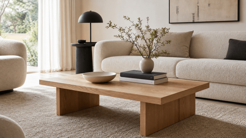
Prism Light Oak Coffee Table
The Prism suits a clean modern room that needs a substantial but visually quiet centerpiece. Its 56-inch rectangular top provides generous surface area, while the 15-inch height keeps the profile low. Oak solids and oak veneer bring in visible grain without adding an ornate silhouette.

Bosk White Washed Coffee Table
The Bosk has more texture and a slightly more collected feel. Its whitewashed natural-wood finish softens the carved details, while aged-black steel feet provide the dark outline that pale wood often needs.
For more shapes and finishes, compare the full modern coffee table collection. If your room already contains warm metals, the brass coffee table guide offers a useful contrast to the quieter light-oak look.
A Few Details Worth Checking Before You Finish
- Matching every pale surface. A light sofa, pale rug, white walls, and light oak table need at least one darker value to create depth.
- Covering the grain. If books, trays, and accessories occupy most of the top, the material loses its purpose. Leave meaningful open space.
- Using only small objects. Many tiny accessories create visual noise. One substantial bowl or vase gives the arrangement an anchor.
- Ignoring the undertone. Cool gray accessories can make honey oak look unexpectedly orange. Use warm gray, taupe, ivory, olive, or charcoal instead.
- Forcing an exact wood match. Near-matches often look accidental. A deliberate light-and-dark wood combination is usually more convincing.
- Choosing a rug with no separation. If the rug and table share the same color and value, use pattern, texture, or a darker border to restore definition.
Then Step Back and Look Again
Stand at the entrance to the room and take in the table as part of the full picture. Its outline should still be easy to read. The oak should connect to at least one other warm note in the room, and the objects on top should register as two or three loose groupings rather than a collection of unrelated things.
If the room still feels flat, remove half the accessories before buying anything new. Then add one dark accent or a more textured rug. Light oak usually needs definition more than decoration.
Frequently Asked Questions
What colors go best with a light oak coffee table?
Light oak works especially well with warm white, cream, oatmeal, taupe, olive, charcoal, muted black, camel, and antique brass. Choose colors that support the wood's warm or neutral undertone rather than surrounding it with icy blue-gray finishes.
Can I mix a light oak coffee table with dark wood furniture?
Yes. Light oak and walnut or espresso wood can create useful depth. Repeat each wood tone at least once elsewhere in the room and use a rug or textile that contains both lighter tan and deeper brown notes to connect them.
What rug color works under a light oak coffee table?
Choose a rug that is slightly darker, more patterned, or more textured than the table. Oatmeal, greige, taupe, ivory with charcoal lines, and quiet vintage-style patterns all provide definition without overpowering the oak.
How many items should I put on a rectangular coffee table?
Think in three visual groups rather than a fixed number of objects. A bowl can form one group, a short stack of books a second, and a vase with airy branches a third. Keep varied heights and leave enough open surface for the oak grain to remain visible.

Leave a comment
This site is protected by hCaptcha and the hCaptcha Privacy Policy and Terms of Service apply.