
A modern table clock is small enough to live anywhere (desk, shelf, mantel, nightstand), but it still does a big design job: it adds structure, a focal point, and a “finished” feeling to a surface. The trick is choosing one that’s the right size for the spot, easy to read at a glance, and styled so it looks intentional (not like a forgotten accessory).
This shelf styling video shows how books, decorative accents, and small statement pieces can work together—perfect inspiration for styling a modern table clock. Watch here.
Quick answer: how to pick the right modern table clock
- Start with placement: desk, mantel, bookshelf, entry console, or nightstand.
- Choose scale on purpose: the clock should be tall enough to “hold the corner” of the surface without blocking sightlines.
- Prioritize readability: strong contrast between hands and face, and numerals (or markers) you can see from your normal viewing distance.
- Match the room’s metals: brass pairs beautifully with warm woods; black metal sharpens modern spaces; mixed metals can work when you repeat them.
- Style with one companion item: a small stack of books, a low bowl, or a vase—keep it simple so the clock stays the hero.
Ready to browse first? Start with Table Clocks, or explore the full Clocks collection for more styles.
1) Where will the table clock live? (This determines size and style)
A good table clock fits the surface it’s on and the way you use that area. Before you shop, decide where it will sit and how far away you usually are when you look at it. That single choice prevents the two most common mistakes: buying too small (it disappears) or too large (it feels crowded).
Desk / office
- Best style: clean, minimal, high-contrast face (easy to read while working).
- Pro tip: choose a silhouette that looks good from an angle—desks are viewed from multiple positions.
- Avoid: overly shiny finishes if your desk faces a window (glare reduces readability).
Mantel / shelf styling
- Best style: sculptural shape (the clock becomes part of the vignette).
- Pro tip: let the clock be the “tall anchor,” then add one medium item and one low item nearby.
- Avoid: placing it dead-center unless the mantel is styled symmetrically on purpose.
Entryway console
- Best style: something with a little presence—entry spaces need strong “first impression” pieces.
- Pro tip: pair with a tray or bowl for keys so the vignette looks cohesive and functional.
- Avoid: clocks that are fragile or tippy if your entry gets heavy traffic.
Nightstand
- Best style: quieter, softer materials and a face that’s easy to read without being visually loud.
- Pro tip: keep the clock smaller than your lamp base so the nightstand doesn’t feel crowded.
- Avoid: anything with bright reflections if you prefer a calm, low-stimulus bedroom.
2) Scale rules that make a table clock look “designer” (not random)
When a table clock looks expensive and intentional, it’s almost always because the proportions are right for the surface. You don’t need a perfect formula—just a couple of simple checks.
- Give it breathing room: leave a few inches of space around the clock so it doesn’t feel squeezed between other decor.
- Anchor one corner: on a console or desk, a clock works best as the “corner anchor,” not floating in the middle.
- Balance height: if you also have a tall lamp, place the clock on the opposite side so the surface feels balanced.
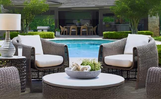
- Use the triangle: for shelves, aim for a tall item (clock), a medium item (vase/photo), and a low item (tray/book stack).
If you’re styling a bigger focal wall too, you might enjoy Large Wall Clocks That Make a Statement. Table clocks and wall clocks can complement each other when they share a finish or shape language.
3) Readability: the most overlooked “luxury” detail
A table clock is a functional object. If you have to lean in to read it, it won’t feel like a confident design choice—just a decoration. Here’s what designers look for:
- Contrast: dark hands on a light face or light hands on a dark face (avoid low-contrast “tone-on-tone” if you want usability).
- Clear markers: numerals, baton markers, or a clean chapter ring that’s visible from the typical viewing distance.
- Minimal glare: glass is fine, but the face should still be readable in daylight and under lamp light.
- Quiet ticking: if the clock will live in a bedroom or office, prioritize a movement that won’t distract you.
4) Materials and finishes: how to match the clock to your room
Modern table clocks often come in metal finishes (like brass or blackened iron), plus glass, wood tones, or stone-like textures. The easiest way to make the clock feel integrated is to connect it to at least one other finish in the space.
Brass / warm metallic
- Pairs naturally with warm oak, walnut, cream upholstery, and woven textures.
- Feels elevated in entryways and living rooms—especially when repeated in a picture frame, lamp, or hardware.
Black / dark metal
- Sharpens modern and transitional spaces and adds graphic contrast.
- Works well with white walls, neutral rugs, and darker wood or stone accents.
If your room mixes metals, it can still look cohesive: repeat each metal at least twice (for example, brass clock + brass lamp + black frame + black hardware).
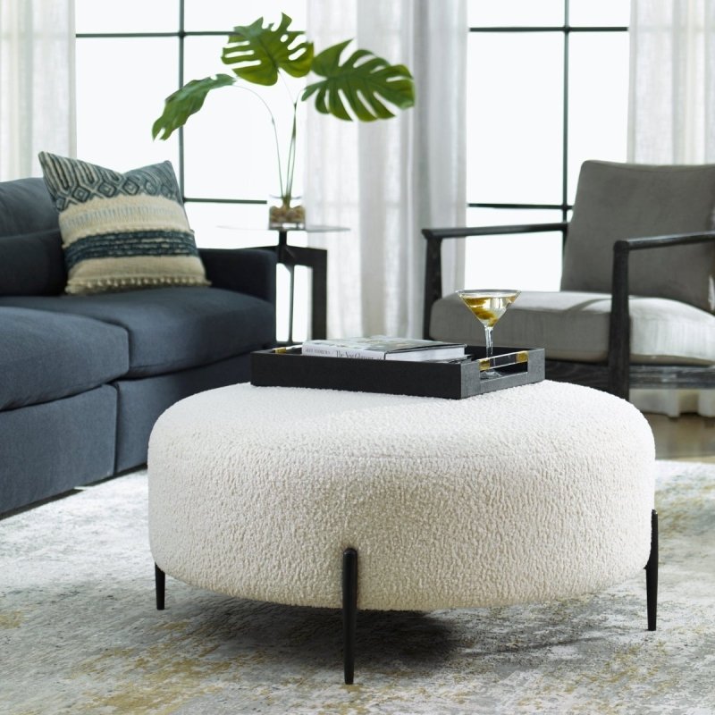
Curated pick: a modern table clock to shop at Modest Hut (2nd gallery image)

A modern, architectural silhouette with a warm brass finish and grounded, aged-black stand—easy to style on a desk, console, or bookshelf.
Want more options? Browse Table Clocks for tabletop styles, or explore all clocks.
5) Styling formulas: 6 easy ways to place a table clock
Use these “plug-and-play” formulas to style a table clock so it feels purposeful. Choose the formula that matches your surface and your lifestyle.
Formula A: Desk corner anchor
- Clock (tall anchor)
- Low tray (paperclips, pens, chargers)
- One book or notebook stack to add height variation
Best for home offices and small desks where you want function first.
Formula B: Mantel vignette (asymmetrical)
- Clock slightly off-center
- Medium vase or sculptural object on the opposite side
- Low bowl or candle to finish the triangle
Best when your mantel already has art or a mirror above it.
Formula C: Bookshelf “bookend”
- Clock on one side of a shelf
- Books in the middle (horizontal stack)
- Small plant or bowl on the other side
Best for open shelves where you want the shelf to read as a styled unit.
Formula D: Entry console “functional style”
- Clock as the tall anchor
- Key tray or catchall bowl
- One framed photo or small art piece leaning behind the tray
Best for high-traffic spaces where you need a landing zone that still looks polished.
Formula E: Nightstand “quiet luxury”
- Clock (smaller scale)
- Lamp (main height)
- One low object (small dish for jewelry or a coaster)
Best for calm bedrooms—keep the face readable and the palette soft.
Formula F: Kitchen / breakfast nook shelf
- Clock (easy-to-read face)
- Cookbook stack
- Small bowl (fruit, napkins, or simply decorative)
Best when you want a subtle “everyday ritual” vibe without clutter.
6) Common mistakes (and quick fixes)
- It feels too small: move it to a tighter surface (nightstand, small shelf) or pair it with one taller companion item to give it context.
- It looks “lost” on a long console: group it with a tray and a medium-height object so it reads as one styled moment.
- It clashes with other metals: repeat the clock’s finish at least once elsewhere (frame, lamp, hardware) so it feels intentional.
- It’s hard to read: choose higher contrast or place it where it’s closer to your typical viewing angle.
FAQ: modern table clocks
What’s the difference between a table clock and a wall clock?
A table clock is designed to sit on a surface (desk, shelf, mantel, nightstand). A wall clock is sized and mounted to read from across a room. Table clocks usually work best when they’re styled as part of a vignette, while wall clocks often act as a focal point.
How big should a table clock be?
The best size depends on where it lives. For desks and nightstands, choose a smaller clock that still reads clearly from your normal distance. For mantels, entry consoles, and bookshelves, a slightly taller clock can act as the “anchor” piece without crowding the surface.
Where should I place a table clock on a bookshelf?
Place it toward one side of the shelf so it acts like a bookend, then balance it with books and one small object. Avoid centering it alone—shelves look best when styled in simple groups with varied heights.
Do table clocks go with modern decor?
Yes. Modern table clocks work especially well when they have clean lines, a clear face, and a finish that matches the room’s metals. Brass, black, and mixed-metal designs can all look modern when the silhouette is simple and the styling stays uncluttered.
How do I style a table clock on an entryway console?
Use the clock as the tall anchor, then add a key tray or bowl for function. Finish with one medium or low piece (like a framed photo or small vase) so the setup looks intentional and not like a single item placed on a long surface.
Should I match my table clock to my hardware and lighting?
Matching exactly isn’t required, but repeating finishes makes a room feel cohesive. If your clock is brass, echo brass somewhere nearby (a lamp, frame, or handle). If you mix metals, repeat each metal at least twice so it feels curated rather than accidental.


,%20but%20it%20still%20does%20a%20big%20design%20job:%20it%20adds%20structure,%20a%20focal%20point,%20and%20a%20%E2%80%9Cfinished%E2%80%9D%20feeling%20to%20a%20surfac...)
Leave a comment
This site is protected by hCaptcha and the hCaptcha Privacy Policy and Terms of Service apply.